Ad Code

Sunday, September 17, 2017

Sling Resource Merger in AEM 6.3


Hello Everyone,
The Sling Resource Merger provides services to access and merge resources. It provides diff (differencing) mechanisms for both:

  1. Overlays of resources using configured search paths
  2. Overrides of component dialogs for the touch-optimized UI (cq:dialog), using the resource type hierarchy (by means of the property sling:resourceSuperType).
Note: sling:resourceMerger concept is basically used for Granite.So this concept is specifically applicable for touch UI.
1. Approach for Overlaying Resources: Resource Overlay works on the path which is having the same hierarchy in /apps. If there is a path in libs: “/libs/text/example”  then Its overlaying path can only be: “/apps/text/example”. This approach saves you from copying the entire structure of libs in apps when you need customizations.You can customize as much as required.
image.PNG
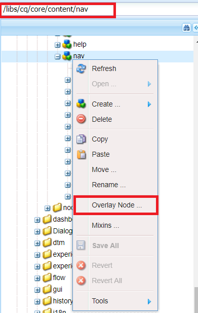
Fig - Overlaying the resource
Example: Customization the consoles
overlays.PNG
Fig - How Overlay works in Resource Merger?
2. Approach for Overriding Resources: This approach works on the property sling:resourceSuperType. This concept is also called inheritance of the resource in AEM.

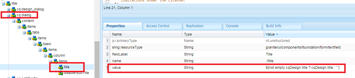
Example: Configuring your page properties
overriding.PNG
Fig - Overriding the resource

override.PNG
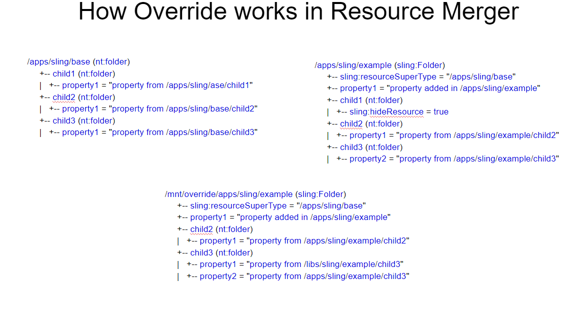
Fig - How Override works in Resource Merger?

Goals of Resource Merger concept in AEM

1.Reduce the structure that is replicated from AEM and reusability of resources.
2.Ensure that any changes should not make in /libs.
Properties of Resource Merger

sling:hideProperties
String or String[]
Hide the properties,The wildcard(*)hides all.
sling:hideResource
Boolean
Indicates that the resource should be completely hidden with its children
sling:hideChildren
String or String[]
Hide the list of children of a particular resource. The wildcard(*)hides all the children.
sling:orderBefore
String
Contains the name of the preceding sibling.

Points to Remember

1.Overrides are not dependent on search paths.They use sling:resourceSuperType property to make a connection.
2.You must not change anything in /libs, The reason may be that when you upgrade your instance or apply any service pack/hotfix, It may be overwritten.So  Any customization you needed should be done in /apps.


Use cases of sling: ResourceMerger

  1. Add a property
  2. Redefine a property(not auto-created properties)
  3. Redefined an auto-created property
  4. Redefine a node and its children
  5. Hide a property
  6. Hide a node and its children
  7. Hide Children of a node (while keeping the properties of the node)
  8. Reorder nodes
Invoking the Sling Resource Merger from your code
The Sling Resource Merger includes two custom resource providers - one for overlays and another for overrides. Each of these can be invoked within your code by using a mount point:
  • Overlay:
    • purpose: merge resources based on their search path
    • mount point: /mnt/overlay
    • Usage: mount point + relative path
    • Example: getResource('/mnt/overlay/' + '<relative-path-to-resource>');
  • Override:
    • purpose: merge resources based on their super type
    • mount point: /mnt/override
    • Usage: mount point + absolute path
    • Example: getResource('/mnt/override' + '<absolute-path-to-resource>');
Since Long, I am trying to find a good example of explaining /mnt/overlay and /mnt/override concept in resource Merger. So finally I got a use case to justify with this concept.
Use Case: Recently I have gone through a scenario, where I want to add some more locales in the drop-down of page properties.
To know from where languages are getting listed out, I check the language widget in the page properties dialog.
Fig - language widget in the page properties dialog
So to populate languages, cq/gui/components/common/datasources/languages is playing an important role.
If I check the language.jsp under /libs/cq/gui/components/common/datasources/languages, you can see that all the languages are coming from /libs/wcm/core/resources/languages.
Fig - Source of language population in the dropdown
Now if I add some more languages in /apps/wcm/core/resources/languages, then the jsp will start taking the values from /apps not /libs, because /apps is having preference over /libs.
But I don’t want to duplicate all the locales in apps as well. So what to do?
1. Overlaying the languages hierarchy: Just add all the new locales in /apps/wcm/core/resources/languages and now overlay the language.jsp with the following modifications.
Fig - Merging the new locale and existing locale using mnt overlay
2. Overriding the languages hierarchy: Add new locales in any hierarchy example I have taken it “/apps/languages/core/resources/languages” and add a property sling:resourceSuperType to /libs/wcm/core/resources/languages.

Fig - Overriding the languages which are available under libs

Overlay the language.jsp with the following modifications.
Fig - Merging the new locale and existing locale using mnt override

Demonstration Video on the Sling Resource Merger (Overlaying + Overriding the Resource):


If you have any query or suggestion then kindly comment or mail us at sgaem.blog02@gmail.com

Hope it will help you guys !!
Thanks and Happy Learning.

Sunday, September 10, 2017

Dynamic (Editable) Templates in AEM6.3 : Part-2

Hello Everyone,
In the previous blog of Dynamic Templates in AEM 6.3 : Part-1, you have already gone through template-types, the creation of dynamic templates and policies etc.
But template editor has much more functionalities to know.The functionality of layout editor comes up with the functionality of dynamic templates within itself but you need to go through with some steps.
How to Configure Emulator in a Page

Emulator Icon won’t be displayed directly in the pages created from the template while using Dynamic Templates. So there is a need to add a configuration in Felix console:
config.PNG
Fig - Emulator Configuration
1.Go to the OSGi configuration named com.day.cq.wcm.mobile.com.impl.MobileEmulatorProvider” Add your base page Component path in this configuration:

2. Make sure that the template-types (e.g.,empty-page) are having a property named cq:deviceGroups in structure hierarchy shown below.
emulator.PNG
Fig - add devicegroups property in the template types
3. The emulator icon will start showing up on the page.
emulator icon.PNG
Fig - Emulator option in the page
But if you want to resize responsive grid using layout editor, the resizing won’t work by default. So there is a need to have a CSS file named grid.less, that helps to use and resize layout container.

grid.less
@import "/etc/clientlibs/wcm/foundation/grid/grid_base.less";

/* maximum amount of grid cells to be provided */
@max_col: 12;

@grid-gutter-width: 24px;
/* default breakpoint */
.aem-Grid {
   .generate-grid(default, @max_col);
   width: auto;
}
/* phone breakpoint */
@media (max-width: 650px) {
   .aem-Grid {
       .generate-grid(phone, @max_col);
   }
}

/* tablet breakpoint */
@media (min-width: 651px) and (max-width: 1200px) {
   .aem-Grid {
       .generate-grid(tablet, @max_col);
   }
}

.aem-GridColumn {
   padding: 0 @grid-gutter-width/2;
}

/* TODO: find a better place for this */
/* additional styling for components in grid */

.aem-GridColumn.text.parbase p {
   *padding: 0 20px;
   text-align: justify;
}

Default Components:In the Responsive grid policy you can see a tab having default components.
default.PNG
Fig - Default Component option in the responsive grid (parsys)
On the Default Components tab, you define which components are being associated with given media types so that when an author drags an asset from the asset browser(content finder), AEM knows that this mime type need to be associated  with which component.
Note: Only components with drop zones (drop targets in cq:editConfig node) are available for such configuration.
Click or tap Add Mapping to add an entirely new component and MIME type mapping.
Select a component in the list and click or tap Add type to add an additional MIME type to an already mapped component. Click the Delete icon to remove a MIME type.
Demonstration Video on Layout Editor and Default Component Feature with Dynamic Template:


Design Dialog with Template Editor
Design dialogs plays a very vital role with template editor. If you create a component having a design_dialog, you can save its value at the template level and all the pages created from that template can use those values.

How it works?
So if we have a design_dialog of a component, it can be configured in the component policy.

Note: Design mode is only available for static templates.
design_dialog.PNG
Fig - Component Policy Option
title dialog.PNG
Fig - Design Dialog in the component policy creation
Where Design_dialog values get stored:
Capture.PNG
Fig - Design Dialog values stored under policy of the template
The values of design_dialog can be fetched over a page using currentStyle Object.
Ex: ${currentStyle.title}

Using Hide Conditions
In a dialog, there can be numerous options to be authored for the user.This may confuse user if he/she sees a lot of options on the user interface.
By using hide conditions, admins, developers, and super users have a way to hide resources based on a set of rules. This feature allows them to decide what resources should be displayed when an author edits.
We are taking an example of List component (/apps/core/wcm/components/list/v1/list) . This is a good example to understand this concept.
How to achieve it:
hideConstions.PNG
Fig - Field in design dialog
Depending on the value of the design_dialog, the corresponding fields can be hide and show in the dialog using “granite:hide condition. It works only on Boolean values.
dialog.PNG
Fig - Adding hide condition in the dialog
Reference: https://docs.adobe.com/docs/en/aem/6-3/develop/components/using-hide-conditions.html
Use Case: There is one more scenario, if a template-author does authoring in the design dialog, and when page author authors that component in the page level, he is not aware about what template authors has already configured. So there is a condition which can help page author to know what template-authors have authored and if they really want to overwrite the values, they can.
design_dialog.PNG
Fig - Text field in design dialog
dialog.PNG
Fig -  Adding value in the title node of dialog based on the design dialog 
Example:
  1. ${not empty cqDesign.title ? cqDesign.title : ' '}
  2. ${not empty cqDesign.showDescription ? cqDesign.showDescription : false}
Demonstration Video on Design Dialog and hide feature in Dynamic Templates:


Note:Special recommendation to watch all videos of this blog to get the concepts more clear.

If you have any query or suggestion then kindly comment or mail us at sgaem.blog02@gmail.com

Hope it will help you guys !!
Thanks and Happy Learning.

Saturday, September 2, 2017

Dynamic (Editable) Templates in AEM 6.3 : Part-1


Hello Everyone,
It’s been a long time, this topic is been on my todo list and finally on my reader's demand, I am writing about this topic. So the concept of dynamic templates being introduced in AEM 6.2 and when AEM 6.3 released, it brings some more improvements in this feature.
Now Creation of templates is not only the developer’s job. AEM has a new role of template-authors and these authors can create templates dynamically at any time as per the requirement.
The more we go in deep, the more things we will find out in this concept.So we will start from the very basics to advance and will learn how template editors work?

Steps to create Dynamic Templates
1. Go to Tools -> General -> Configuration Browser
cofiguration.PNG
Fig - Configuration Browser Option 
2. Create Configuration, Title should be your project name and check on editable templates.
createConfig.PNG
Fig - Create template folder under conf directory
3.It will create the basic hierarchy of templates in /conf directory.
directory.PNG
Fig - Hierarchy of editable template under conf directory

There are three parts of template editor: 
  • templates Here all the dynamic templates are contained which are created by template authors.
  • policies: There are two types of policies:
  1. Template Level Policy: This policy is used to define client side libraries of all the pages, created from a particular template.
  2. Component Level Policy: These policies are used to define components for a particular responsive grid (parsys)for all the pages created from the template.
  • template-types: This is a base template on the basis of which template author creates all its templates at the run time.
There are three parts of a template:
  • initial: Initial Content mode is used to define content that will appear when a page is first created based on the template.The initial content can then be edited and removed by page authors.
  • policies: Here a particular template is linked to a policy by using cq:policy property.
  • structure:
  1. The structure allows you to define the structure of the template.
  2. The components defined in the template level can’t be removed from the resulting page.
  3. If you want that template authors can add and remove components, add a paragraph system to the template.
  4. Components can be locked and unlocked to allow you to define initial content.

To start working on dynamic templates, we need to create a page Component.
1.Go to the project hierarchy, and click on Create Component.
page.PNG
Fig - Creation of Page Component
2. No need to create page.html because it will be getting fetched from
sling:resourceSuperType (core/wcm/components/page/v1/page).

Now create a base template-type
1. Creation of a template-type is a job of developer which helps template authors to create it’s dynamic (editable) templates.
2. Go to /conf/my-project/settings/wcm/template-types.Create a node “empty-page” of type cq:Template.
template.PNG
Fig - Creation of template-types
3. Create a node named “jcr:content” of type “cq:pageContent” under “empty-page”  having “jcr:title” and “jcr:description”.
emptty page.PNG
Fig - add basic property in template-type

4. Create “initial” of type “cq:page” inside “empty-page”.
initial.PNG
Fig - Creation of Initial Hierarchy of Template-types

5. Create a Node “jcr:content” of type cq:pageContent under initial node and add a property "sling:resourceType" pointing to a page Component (myproject/components/page/page).
initial properties.PNG
Fig - Adding the page component as a rsource type in intial structure of template-types

initial hierarchy:
    +initial(cq:Page)
       +--jcr:content(cq:PageContent)
            sling:resourceType :myproject/components/page/page

6. Create structure node hierarchy exactly like you have created initial hierarchy under “empty-page”.
structure hierarchy:
   +structure(cq:Page)
       +--jcr:content(cq:PageContent)
            sling:resourceType :myproject/components/page/page
            cq:deviceGroups :/etc/mobile/groups/responsive
             +--root(nt:unstructured)
              sling:resourceType :wcm/foundation/components/responsivegrid
              +--cq:responsive
                 +--breakpoints
                   +--phone
                      title: Smaller Screen
                      width{Long}: 650
                   +--tablet
                      title: Tablet
                      width{Long}: 1200

7. Now create policies hierarchy under “empty-page”.

policies hierarchy:
   +policies(cq:Page)
       +--jcr:content
            sling:resourceType : wcm/core/components/policies/mappings
            +--root(cq:PageContent)
            sling:resourceType : wcm/core/components/policies/mapping

8. Create a image of name “thumbnail.png” to create a thumbnail of template-type. Now I am ready with the base template type and the role of template author has been started.
How Template author Creates Dynamic Templates?
1. Go to Templates-> Go to your project-> Create-> Choose empty template.
template choose.PNG
Fig - Creation of Editable Template from Template-tyes
2. Name the template(i.e., Base Page Template) and Open the template.

3. There will be a responsive grid available.
image.PNG
Fig - Responsive Grid (Layout - Container) in the Editable Template

Demonstration video of Creating a template-type, editable template and create pages from it:


Now Understand what is Template Level Policy?
Template level policy allow you to define specific client-side-libraries for a particular template.
1.Go to the template Page Design.
pageDesign.PNG
Fig - Select the Page Design option for creating the template level policy in Editable template 

2.You can see the dialog over template author can add client side libraries at the run time by creating a template level policy.
page policy.PNG
Fig -  Creation of Template Level Policy 

Understand the structure of the template level policy on node levels.

templates.PNG
Fig  - Flow and Structure of Template level policy

Benefits of Template level policy:
  • Now there is no need to include or hard code client libraries in the page component.
  • Template authors can dynamically add or remove client side libraries as per the requirements.

Now Understand what is Component Level Policy?
We are going to have the policy of a Layout container.
parsys policy.PNG
 Fig - Option for creating the Component Level Policy
layout container.PNG
 Fig - Creation of  Component Level Policy

So, In layout level Policy, you can create a policy and allowed component for a particular layout container. Only the selected components in the policy will be able to use by page authors for that specific container.
Note:Configuring a policy is mandatory for container components as it enables you to define components that will be available in the container.
Note: If we want to provide flexibility to page authors to drag components in the container, then don’t forget to unlock parsys.
mapping.PNG
 Fig - Flow and Structure of Component Level Policy
Note: Enable the template and you can create multiple pages for your website from a particular template.
But there is a need to allow template under a hierarchy,where you want to create pages from that template.
Create a page without a template(you need to create page manually) and add a property in page properties dialog.
page properties.PNG
 Fig - Allowed Template for creating the page 

page.PNG
 Fig - Page Creation from editable template

Now you will see the templates when you create pages from that template.
Demonstration video of template level policy and component level policy:


If you have any query or suggestion then kindly comment or mail us at sgaem.blog02@gmail.com

Hope it will help you guys !!
Thanks and Happy Learning.